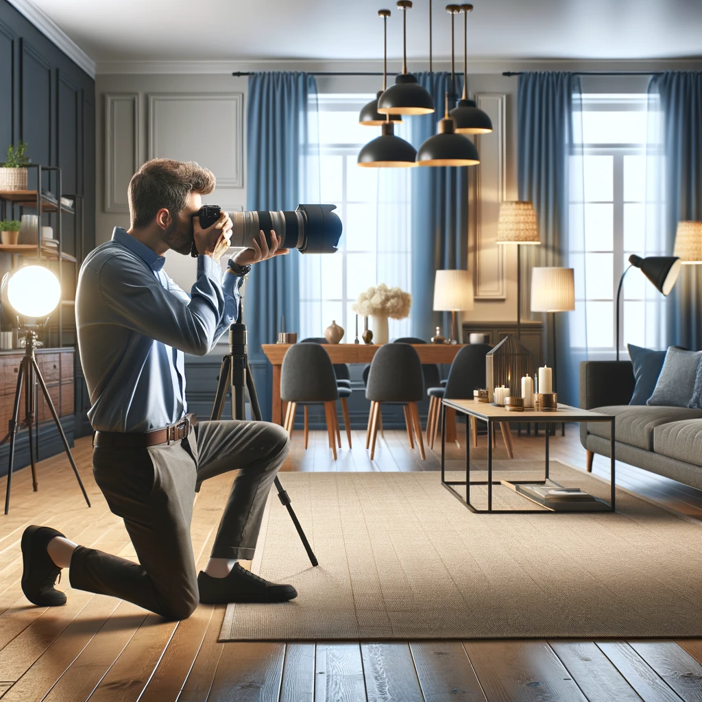
Below are the six families, where you have probably seen each one, the styles it pairs with, and the mistake to avoid.
Classic Color Palette 1: Neutral Bliss
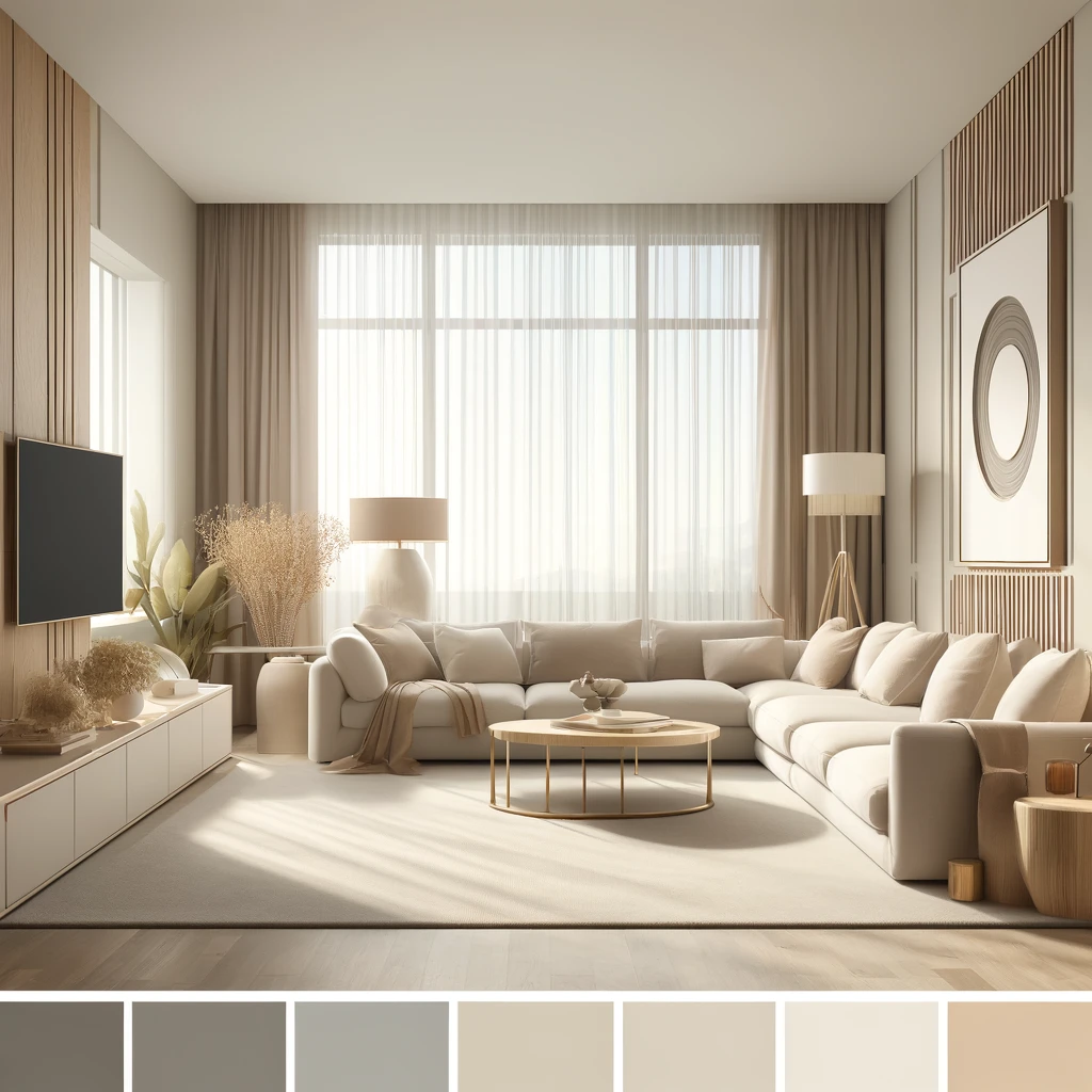 Warm whites, creams, greiges, taupes and soft grays. Neutrals feel calm and open and let wood, linen and stone carry the interest.
Where you've seen it:
- The white spiral rotunda of Frank Lloyd Wright's Guggenheim Museum in New York
- Pantone's Color of the Year for 2026, Cloud Dancer, a soft white
Best interior design styles:
- Modern
- Minimalist
- Scandinavian
- Contemporary
Watch out for: flatness. Layer textures and keep undertones consistent; a cool gray beside a yellow cream can look dingy.
Classic Color Palette 2: Bold and Beautiful
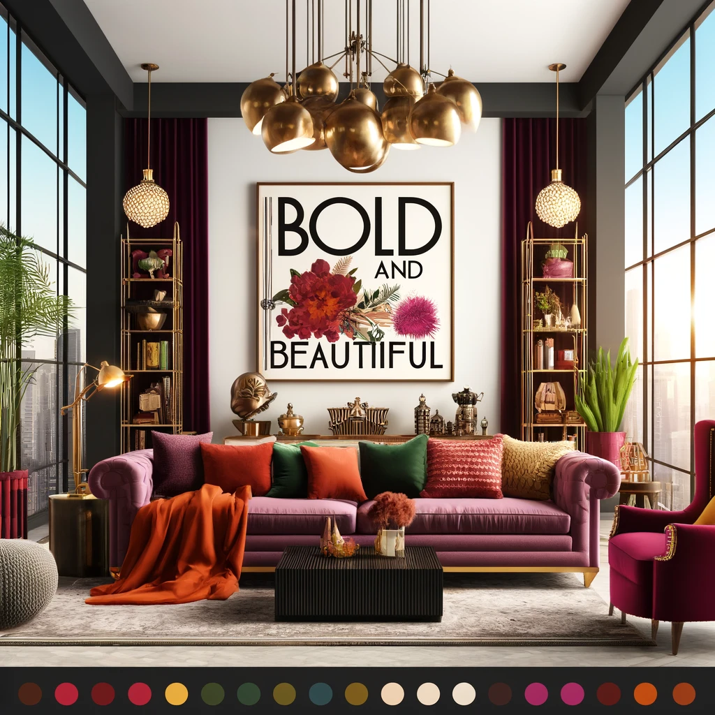 Saturated reds, cobalt, mustard and black bring energy and drama.
Where you've seen it:
- The reds and golds of Baz Luhrmann's "Moulin Rouge!" (2001)
- Dark-painted dining rooms and libraries, where a deep wall makes the room feel intimate
Best interior design styles:
- Eclectic
- Maximalist
- Art Deco
- Hollywood Regency
Watch out for: bold walls read darker in rooms with little daylight. Try the color on one wall or on cabinetry first.
Classic Color Palette 3: Earthy Elegance
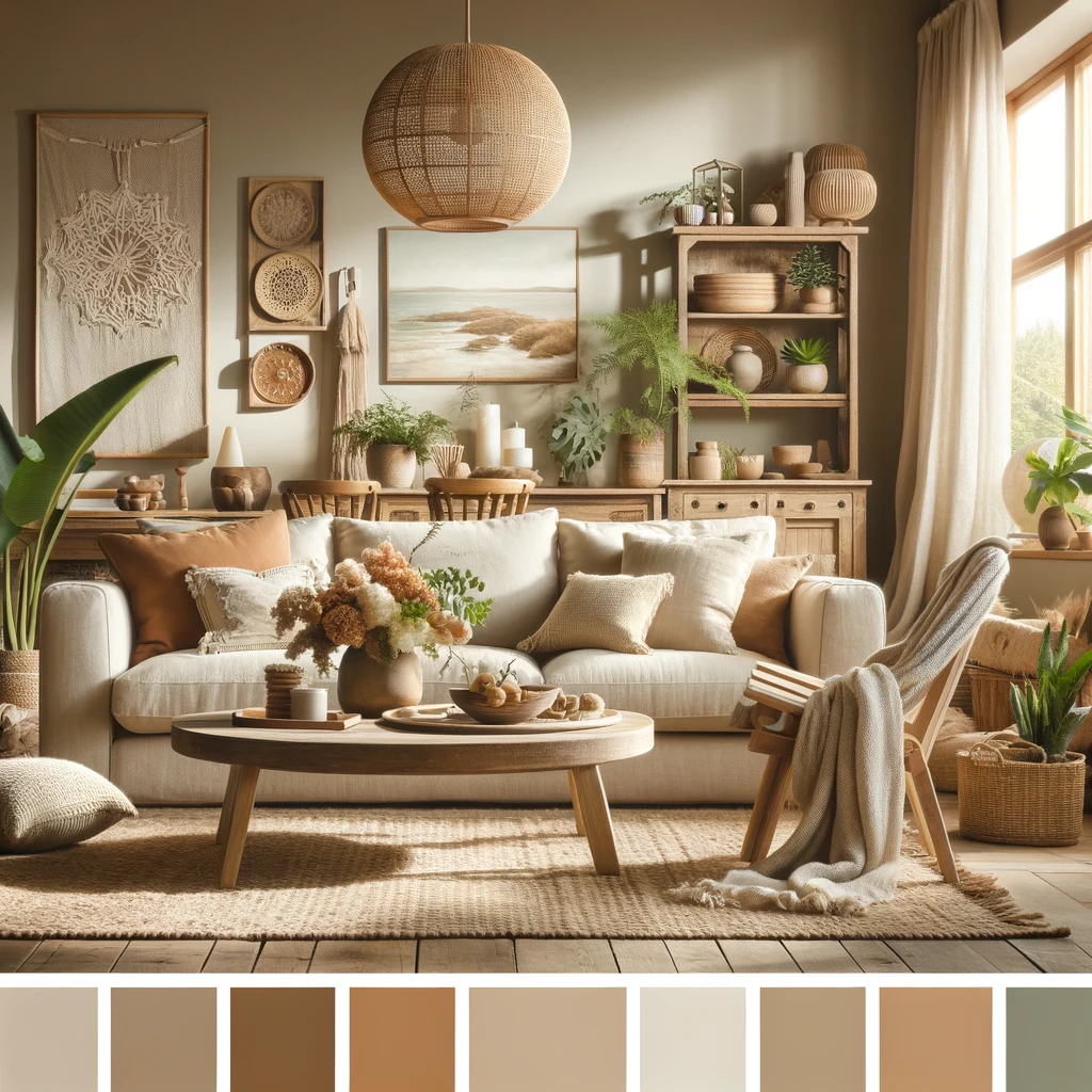 Terracotta, clay, ochre, olive, sand and warm browns, taken from natural materials. They make a room feel warm and grounded.
Where you've seen it:
- Frank Lloyd Wright's Fallingwater in Pennsylvania, where local stone and wood tie the house to its site
- Pantone's Color of the Year for 2025, Mocha Mousse, a warm brown
Best interior design styles:
- Bohemian
- Farmhouse
- Rustic
- Coastal
Watch out for: heaviness. Break up warm browns with off-white walls, greenery or one cool accent.
Classic Color Palette 4: Pastel Perfection
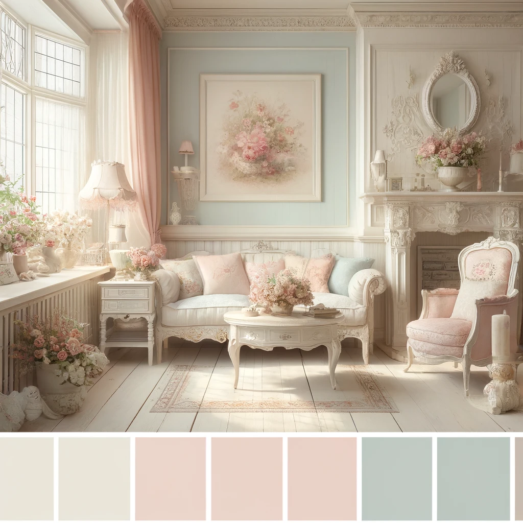 Blush, mint, powder blue, lavender and butter yellow give a soft, light feel with a touch of nostalgia.
Where you've seen it:
- Wes Anderson's "The Grand Budapest Hotel" (2014)
- The Ladurée tea rooms in Paris
- Pantone's Color of the Year for 2024, Peach Fuzz, a soft peach
Best interior design styles:
- Shabby Chic
- French Country
- Vintage
- Cottage
Watch out for: a sugary look when every surface is pale. Anchor pastels with one darker element, such as a charcoal sofa or black hardware.
Classic Color Palette 5: Jewel Tones
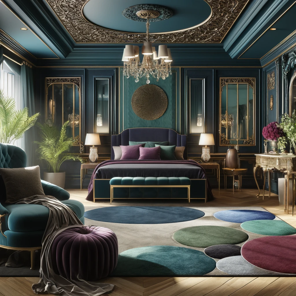 Deep, saturated colors named after gemstones: emerald, sapphire, amethyst, ruby. They bring depth and luxury, especially on velvet, lacquer and tile.
Where you've seen it:
- Art Deco interiors and their revivals, including the sets of "The Great Gatsby" (2013)
- Hotel bars with emerald velvet banquettes or sapphire tile
Best interior design styles:
- Art Deco
- Maximalist
- Hollywood Regency
- Eclectic
Watch out for: jewel tones competing. Let one lead, use a second sparingly, and give them a neutral or brass backdrop.
Classic Color Palette 6: Biophilic Hues
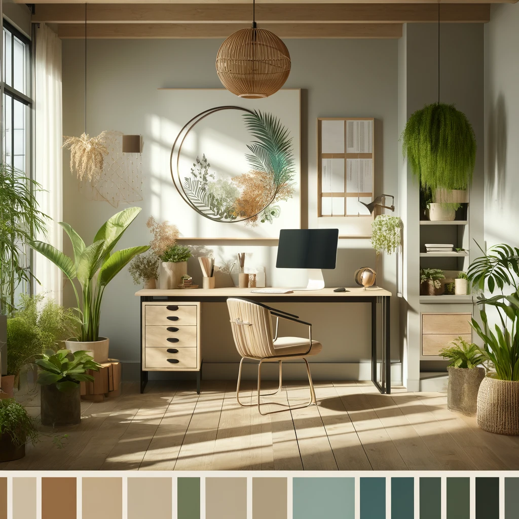 Sage, moss, eucalyptus, olive, sand and soft clay, borrowed from plants, wood, water and stone. They bring the outdoors in and are often described as calming, which is why they suit bedrooms and home offices.
Where you've seen it:
- Spas and wellness spaces
- Projects that pair green walls with natural timber and real plants
Best interior design styles:
- Japandi
- Minimalist
- Scandinavian
- Contemporary
Watch out for: greens that turn gray or muddy in low light. Check a sample at different times of day.
Testing a palette before you paint
Light direction, bulb color temperature and floor color all change how a color reads, so paint large sample patches on two walls and check them morning, afternoon and evening. Keep trend colors for things that are cheap to change, and keep tile, countertops and flooring in a palette you will still like in ten years.
Frequently asked questions
How do I choose a color palette for a room?
Start with something fixed that you love, such as a rug, a piece of art or the view, and build around it. Pick one dominant color for walls and large surfaces, a secondary color for furniture and textiles, and one or two accents for decor. Then test the combination in the room, because light and time of day change how every color reads.
What is the 60-30-10 rule in interior design?
It is a rule of thumb for balancing a palette: roughly 60% of the room in your dominant color (walls, large furniture), 30% in a secondary color (upholstery, curtains, rugs) and 10% in accents (pillows, art, accessories). It keeps bold palettes like jewel tones from overwhelming a space.
What is Pantone's Color of the Year for 2026?
Pantone's Color of the Year for 2026 is Cloud Dancer (PANTONE 11-4201), a soft white. It follows Mocha Mousse, a warm brown, for 2025 and Peach Fuzz, a soft peach, for 2024. In a home, a trend color works best in things you can change easily rather than in permanent finishes.
Can I preview a color palette in my own room before committing?
Yes. Upload a photo of the room to the SofaBrain design studio, pick a style and one of its 20 color palettes (such as Earthy Neutrals, Scandinavian Whites or Jewel Tones), or use the wall paint tool to recolor only the walls. Each image costs 1 credit, and a free account includes 3 credits with no credit card. Screens do not match paint exactly, so confirm your choice with physical samples.
What color palette is best when selling a home?
Neutrals such as warm whites, greiges and soft earth tones photograph well and let buyers picture their own furniture in the space. Keep walls and large surfaces neutral and limit saturated colors to accents that are easy to change.