On this page+
Reviewed by SofaBrain Editorial Team
Editorial Team · Published 2026-05-01 · Last reviewed 2026-05-20
Mastering Interior Design Color Palettes: Classic Schemes and 2024 Trends
Color is a powerful tool in interior design, capable of transforming the mood, atmosphere, and overall feel of a space. As a world-class interior designer and educator, I'm excited to share with you some of the most celebrated color palettes used by professionals, as well as a couple of exciting trends to watch out for in 2024. Let's dive in and explore the world of color in interior design!
Classic Color Palette 1: Neutral Bliss
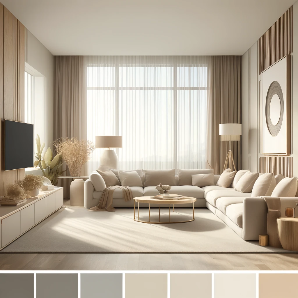 Neutral color palettes are a timeless choice, offering versatility, sophistication, and a calming ambiance.
Famously seen on:
- The Guggenheim Museum in New York City
- The movie "The Devil Wears Prada" (2006)
- Celebrity homes like those of Kim Kardashian and Kanye West
Best interior design styles:
- Modern
- Minimalist
- Scandinavian
- Contemporary
Classic Color Palette 2: Bold and Beautiful
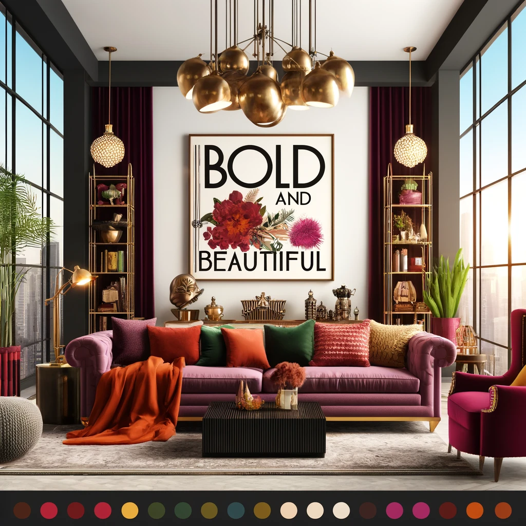 Bold color palettes make a statement, injecting energy, personality, and drama into a space.
Famously seen on:
- The Schiaparelli fashion house in Paris
- The movie "Moulin Rouge!" (2001)
- Celebrity homes like those of Beyoncé and Jay-Z
Best interior design styles:
- Eclectic
- Maximalist
- Art Deco
- Hollywood Regency
Classic Color Palette 3: Earthy Elegance
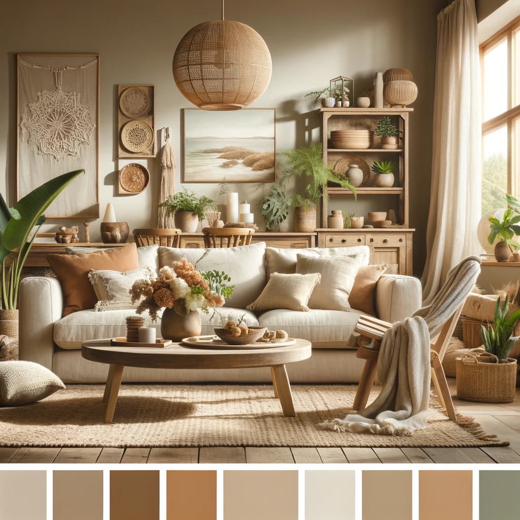 Earthy color palettes create a warm, inviting atmosphere, drawing inspiration from nature and organic materials.
Famously seen on:
- The Fallingwater House by Frank Lloyd Wright
- The movie "Out of Africa" (1985)
- Celebrity homes like those of Oprah Winfrey and Ralph Lauren
Best interior design styles:
- Bohemian
- Farmhouse
- Rustic
- Coastal
Classic Color Palette 4: Pastel Perfection
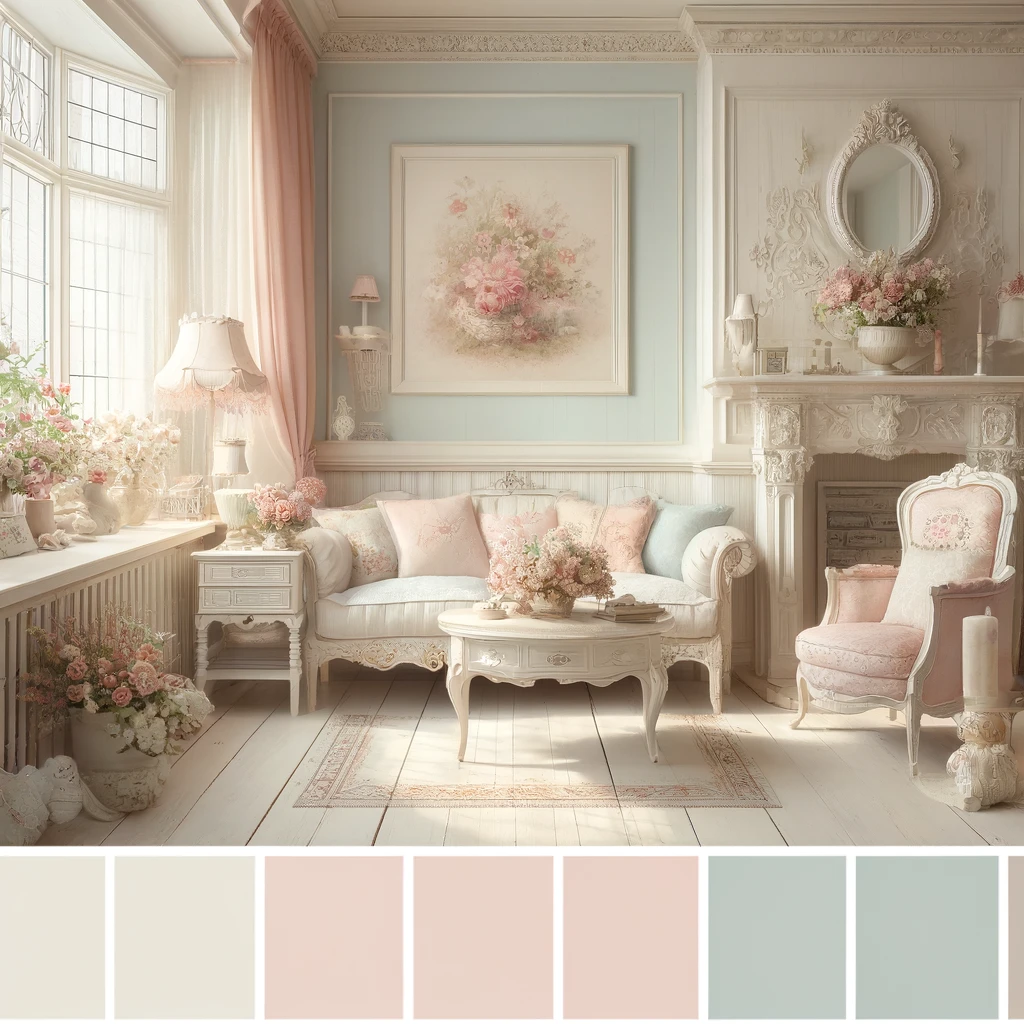 Pastel color palettes evoke a soft, romantic feel, bringing a touch of whimsy and nostalgia to a space.
Famously seen on:
- The Grand Budapest Hotel in the movie of the same name (2014)
- The Ladurée tea rooms in Paris
- Celebrity homes like those of Taylor Swift and Zooey Deschanel
Best interior design styles:
- Shabby Chic
- French Country
- Vintage
- Cottage
2024 Trend 1: Jewel Tones
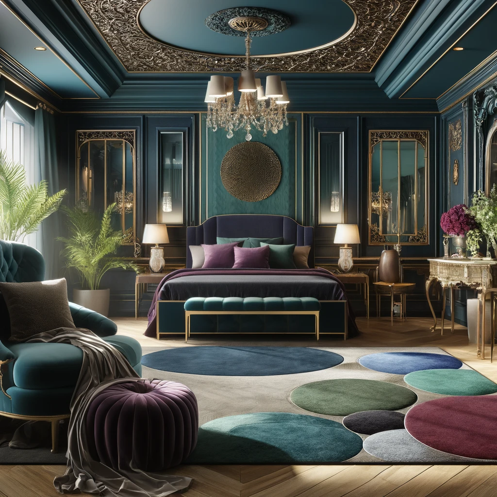 Jewel tones are set to make a big splash in 2024, bringing a sense of luxury, depth, and sophistication to interiors.
Famously seen on:
- The Pantone Color of the Year 2024 predictions
- High-end boutique hotels and restaurants
- Celebrity homes and events
Best interior design styles:
- Art Deco
- Maximalist
- Hollywood Regency
- Eclectic
2024 Trend 2: Biophilic Hues
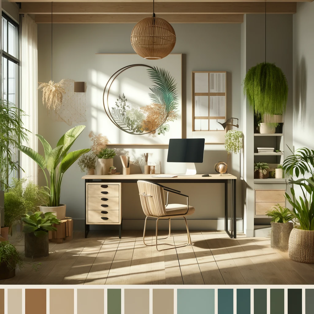 Biophilic colors, inspired by nature and designed to promote well-being, are gaining popularity in 2024 interior design trends.
Famously seen on:
- Sustainable and eco-friendly design projects
- Wellness retreats and spas
- Home office and workspace design
Best interior design styles:
- Japandi
- Minimalist
- Scandinavian
- Contemporary
Remember, while these color palettes and trends provide a great starting point, the key to successful interior design is to create a space that reflects your unique personality and lifestyle. Don't be afraid to experiment, mix and match, and trust your intuition when it comes to choosing colors for your home.
As you embark on your interior design journey, keep in mind that color is just one aspect of the overall picture. Texture, pattern, lighting, and furniture all play crucial roles in creating a cohesive, inviting space. But with a strong foundation in color theory and an understanding of these classic palettes and emerging trends, you'll be well on your way to designing a home that's both beautiful and meaningful.
So go ahead, embrace color, and let your creativity shine. Your perfect interior design palette awaits!
Frequently asked questions
How do I choose a color palette for a room?
Start with something fixed that you love — a rug, artwork, a view — and build around it. Pick one dominant color for walls and large surfaces, a secondary color for furniture and textiles, and one or two accent colors for decor. Then test the combination in the actual room: light direction and time of day change how every color reads.
What is the 60-30-10 rule in interior design?
It's the classic proportion guide for balancing a palette: roughly 60% of the room in your dominant color (walls, large furniture), 30% in a secondary color (upholstery, curtains, rugs), and 10% in accent colors (pillows, art, accessories). It keeps bold palettes like jewel tones from overwhelming a space.
Which color palettes are trending right now?
Two directions stand out: rich jewel tones — emerald, sapphire, amethyst — for depth and luxury, and biophilic, nature-inspired hues like sage, moss, and warm earth tones for calm, wellness-oriented spaces. Both are covered in detail above, along with the design styles they pair best with.
Can I preview a color palette in my own room before committing?
Yes. Upload a photo of your room to SofaBrain, pick a design style, and apply any of its color palettes — from Earthy Neutrals and Scandinavian Whites to Jewel Tones and Deep Blues — to see the whole scheme rendered in your actual space before you buy a single can of paint.
What color palette is best when selling a home?
Broadly appealing neutrals — warm whites, greiges, and soft earth tones — photograph well and let buyers project their own style onto the space. Save saturated statement colors for accents that can be swapped out, and keep walls and large furniture in the neutral range.
More on Interior Design
The Only Interior Design Styles you need to Know
Redesign a room into a beautiful work of art in just seconds. Here is how.
Virtual Staging: The Definite Guide by SofaBrain
Our Definite Guide to the Do's and Don'ts of Virtual Staging
How to clean up a messy room in 10 seconds
Need to send a quick image of a room to a client? Here is how.
Virtual Staging for Real Estate Photographers
Delivering more value for your clients